Project Overview:
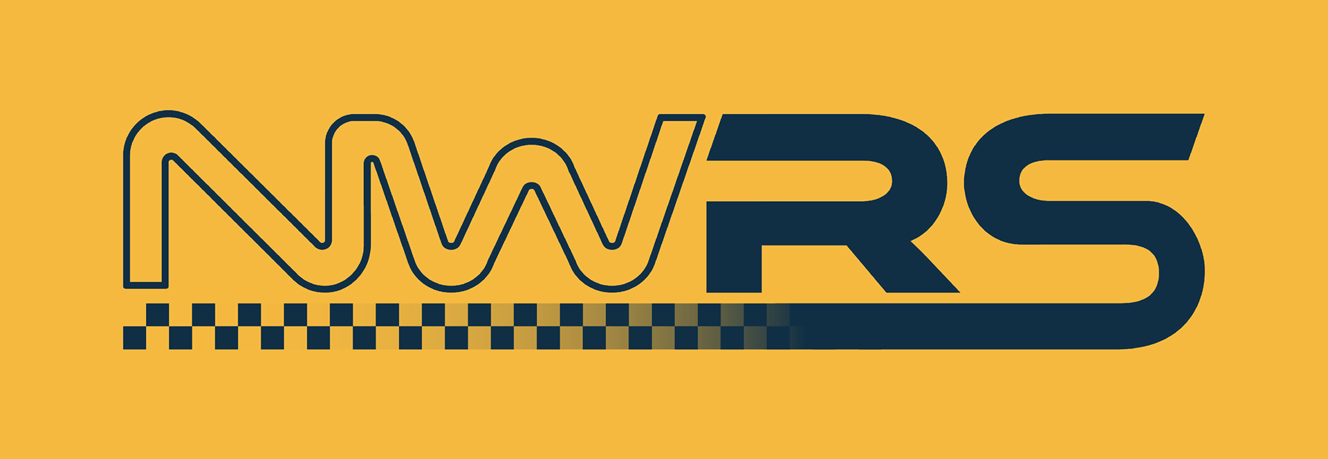
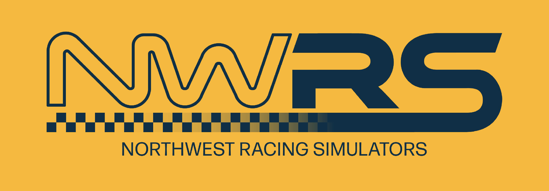
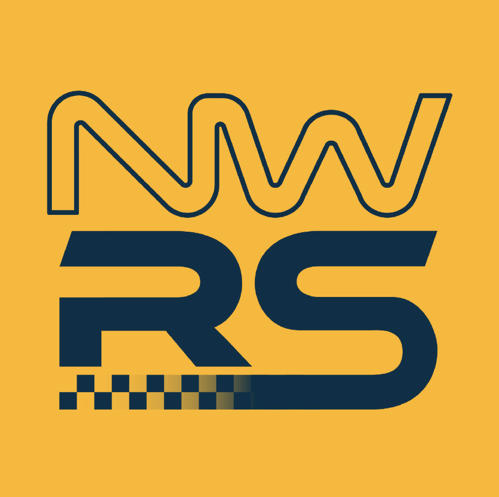
Northwest Racing Simulators came to me hoping to develop a logo for their growing business creating racing simulator setups. They had a general concept for a text based logo of the initials that they wanted to run with, and wanted to make sure that it had elements that invoked the spirit of racing.
Scope:
The client was hoping for a quick turnaround on this project in order to start marketing and create a website, and just needed a logo without extensive branding. We were able to execute this project together in just a few days.
My Role:
This project was done as a freelance projectby myself.
Inspiration:
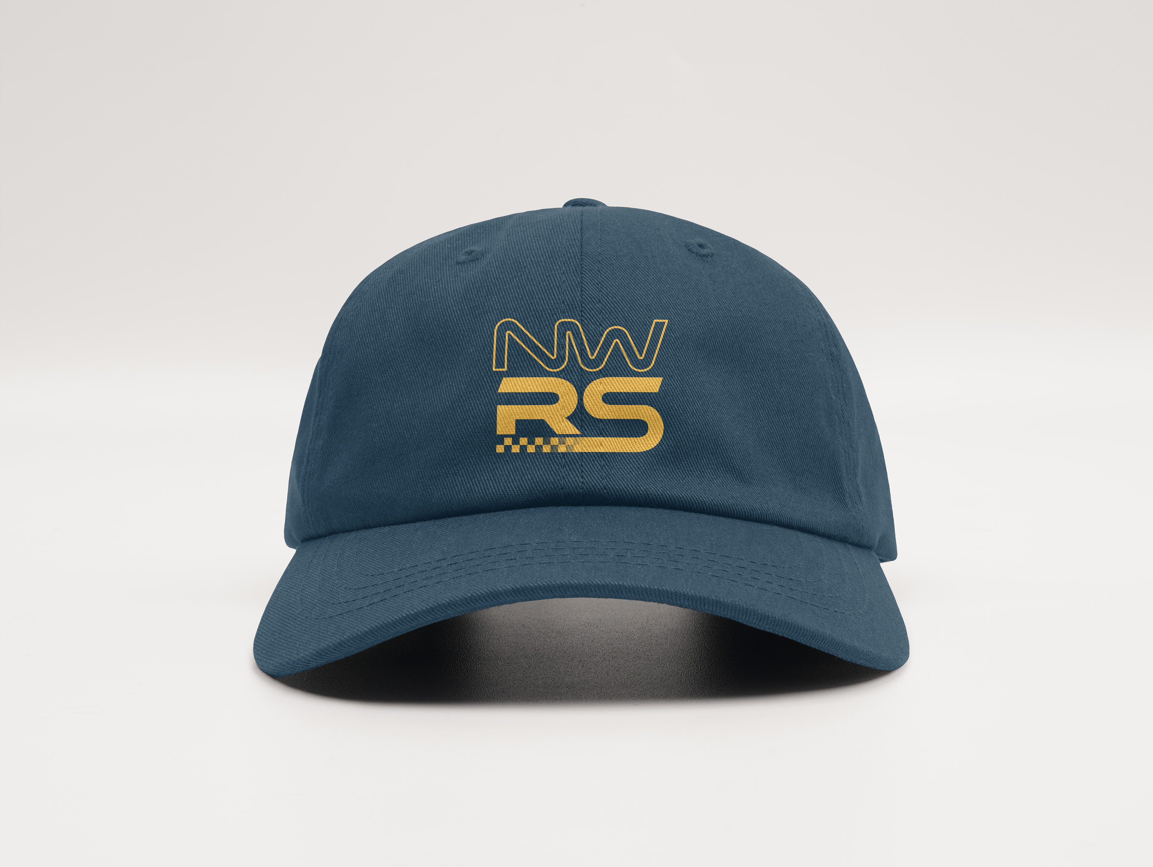
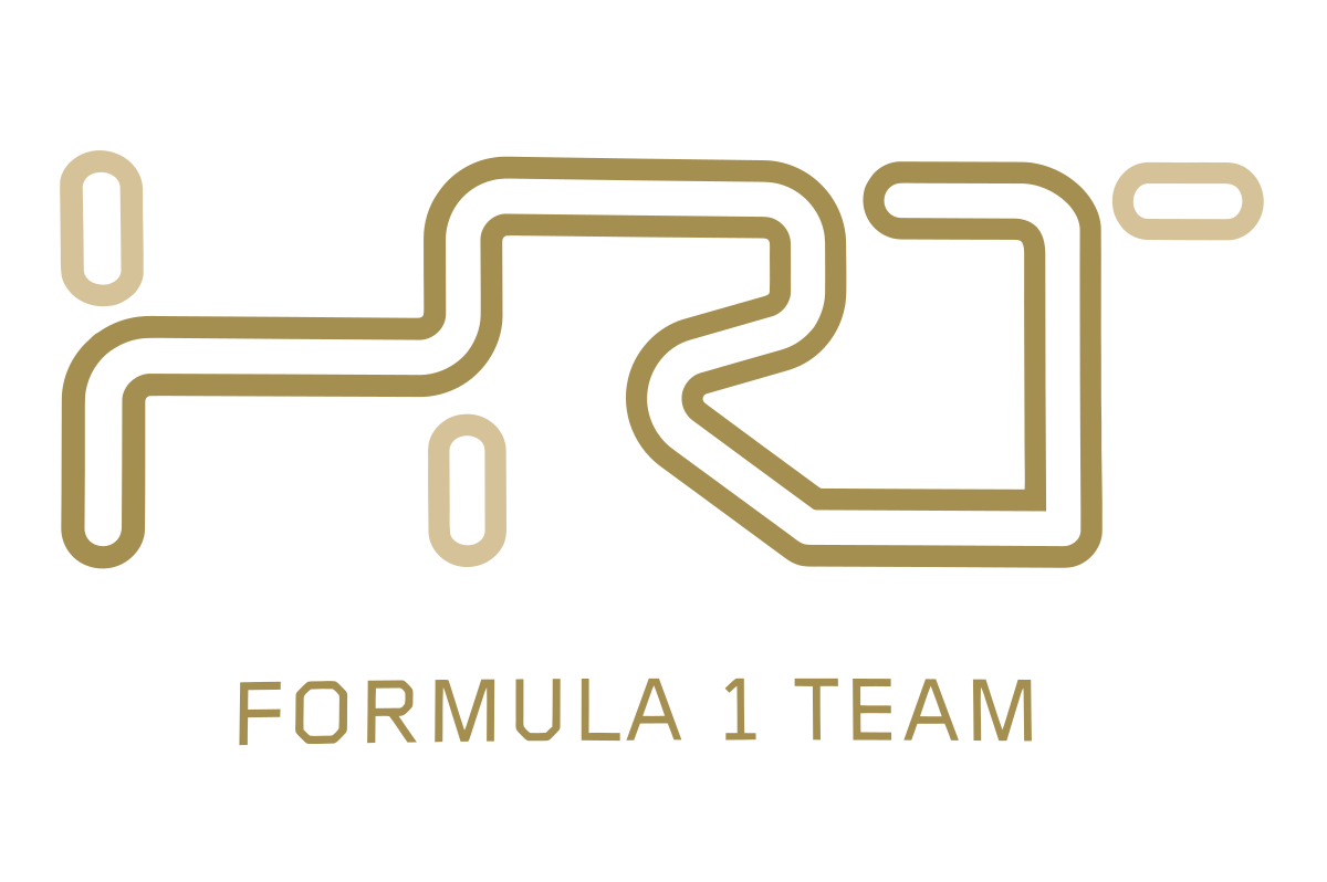
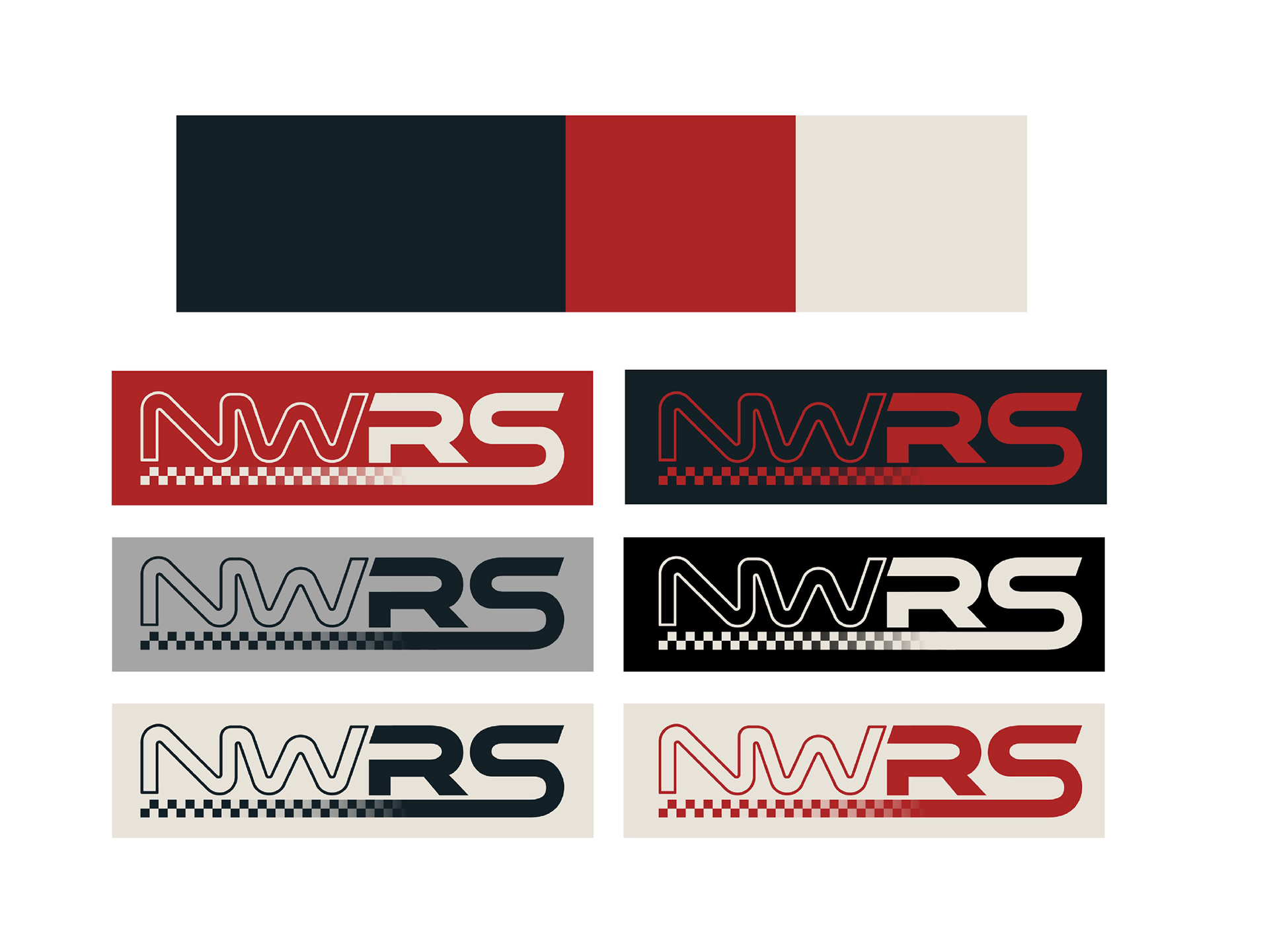
The client wanted this logo to reflect speed, racing, and motion. They generally liked a more minimalist look that had shapes that made references to racing. They liked this existing logo and it's reference to a race track.

Process:
The client came into this process with a few pages of sketches, so we took their favorite concepts and worked with them to elevate and clean them up, as well as explored a lot of different typefaces that felt clean but edgy and sporty.
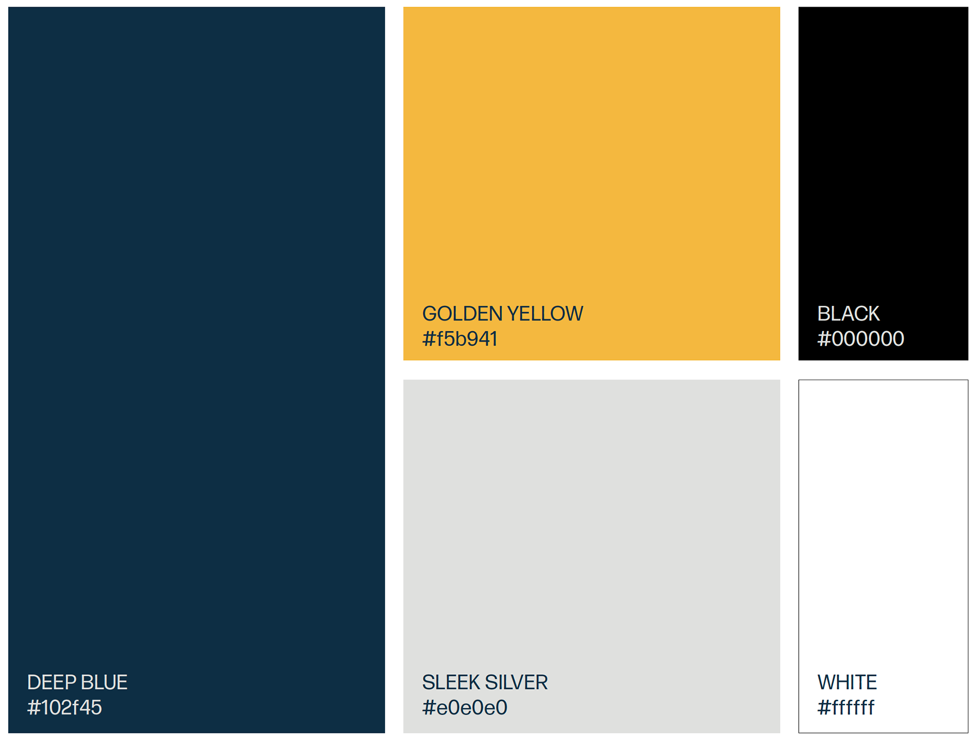
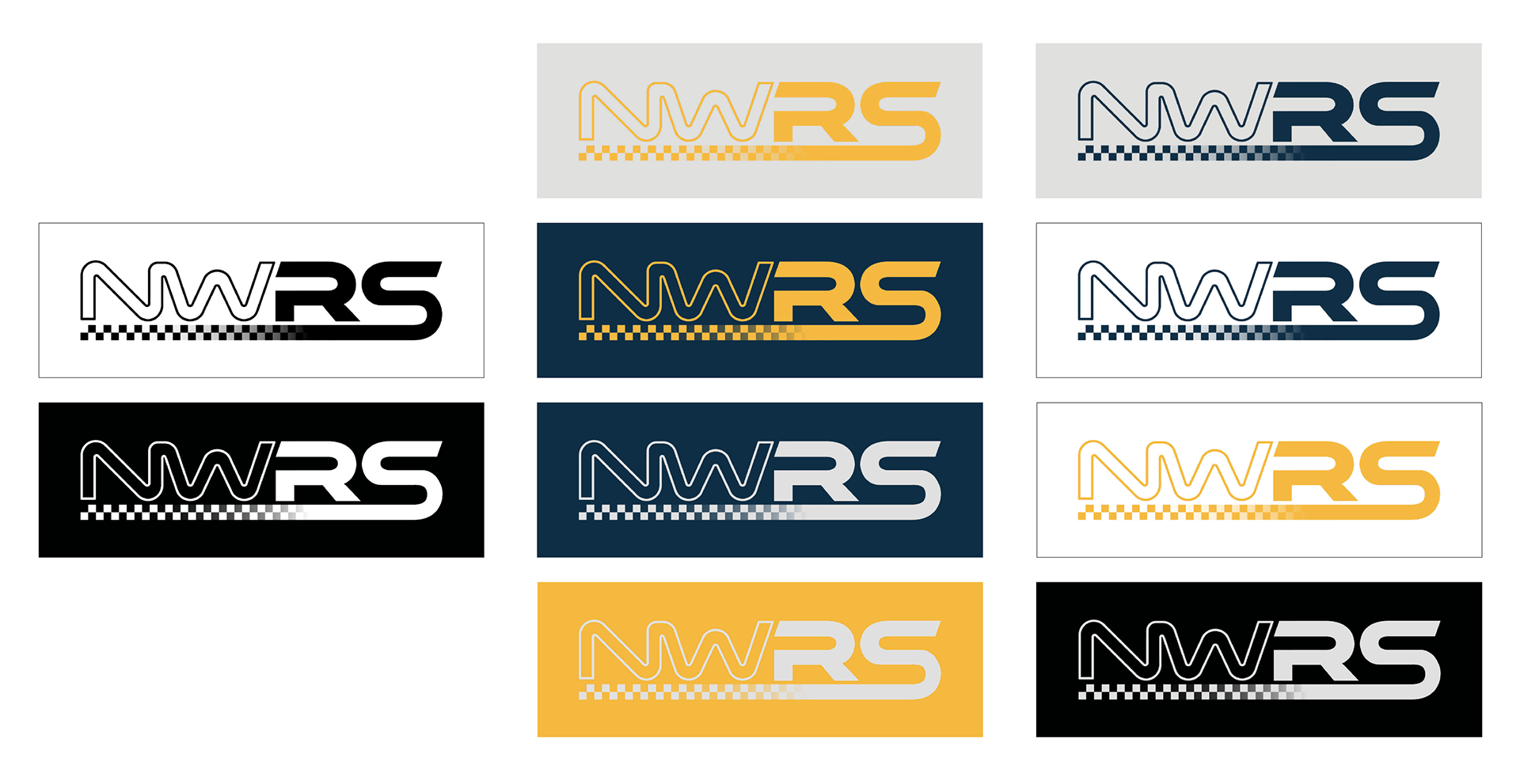
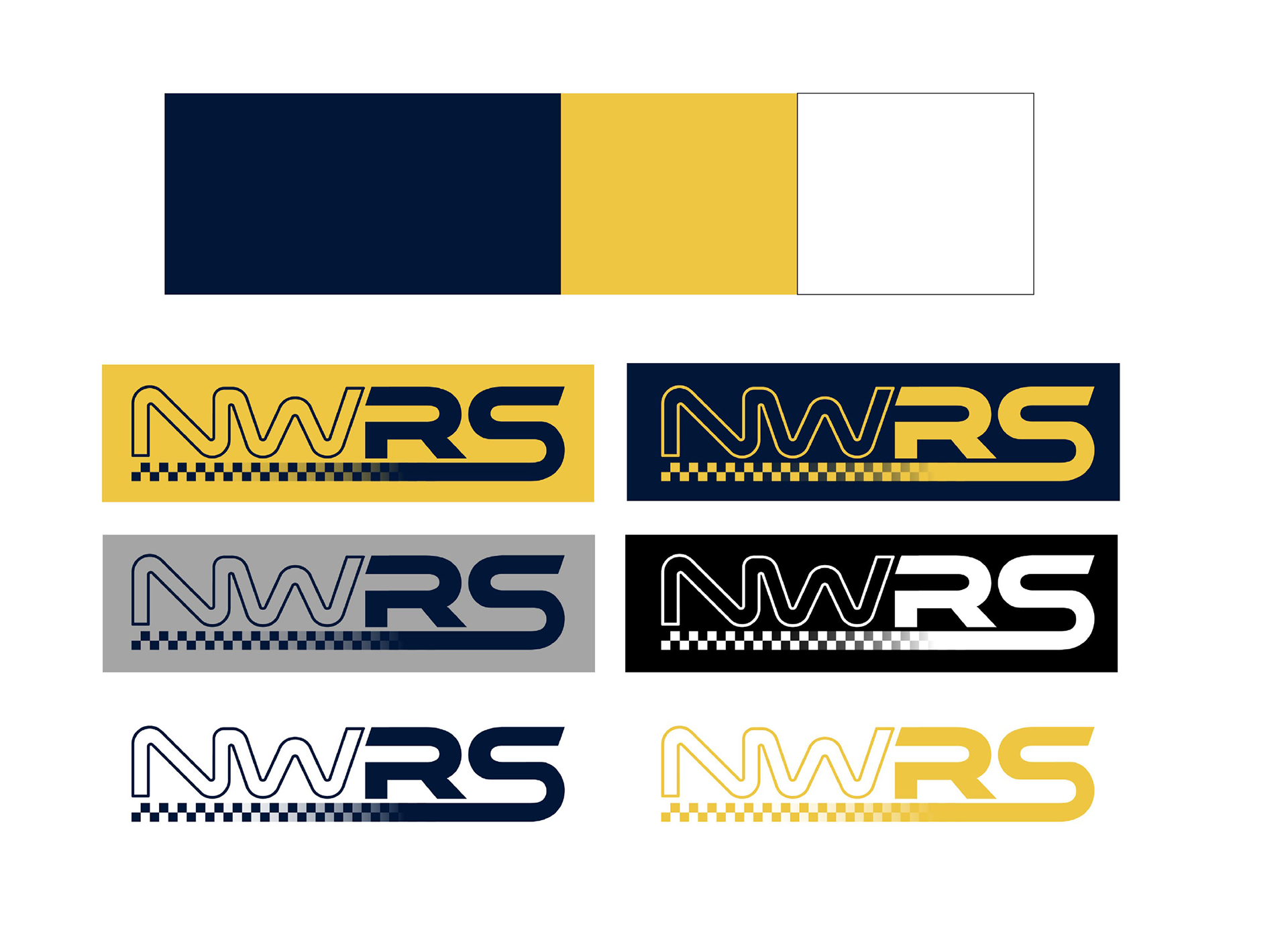
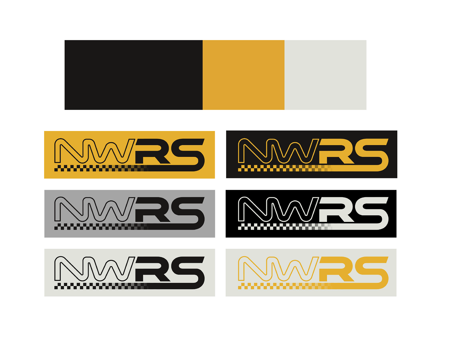
After reviewing the concepts, the client was excited about the right half of one concept, and the outlined letters of another, so we worked on combining them into a new concept. Once we picked a direction, we began exploring colors. The client originally wanted to use a dark blue and a yellow, but I also provided some alternative combinations in case they wanted to explore something else.


Final Design:
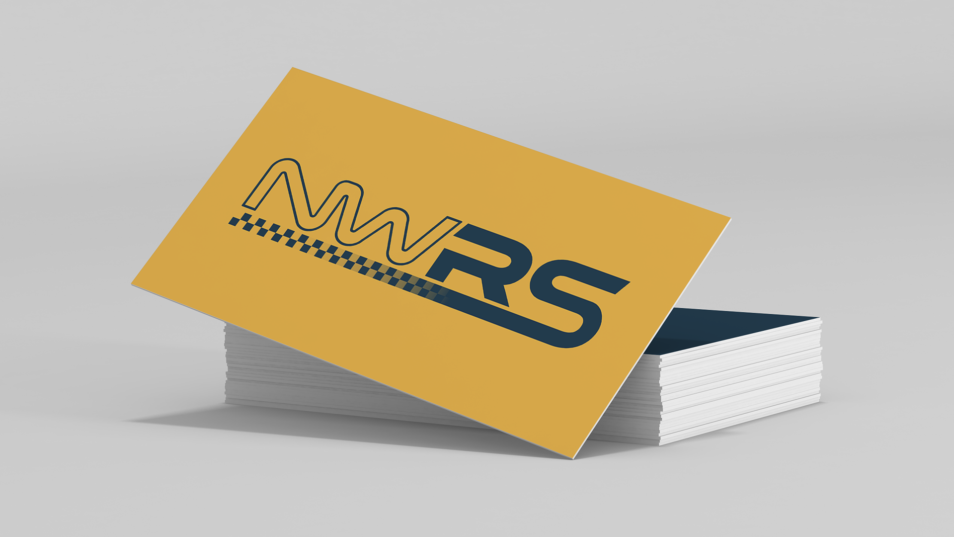
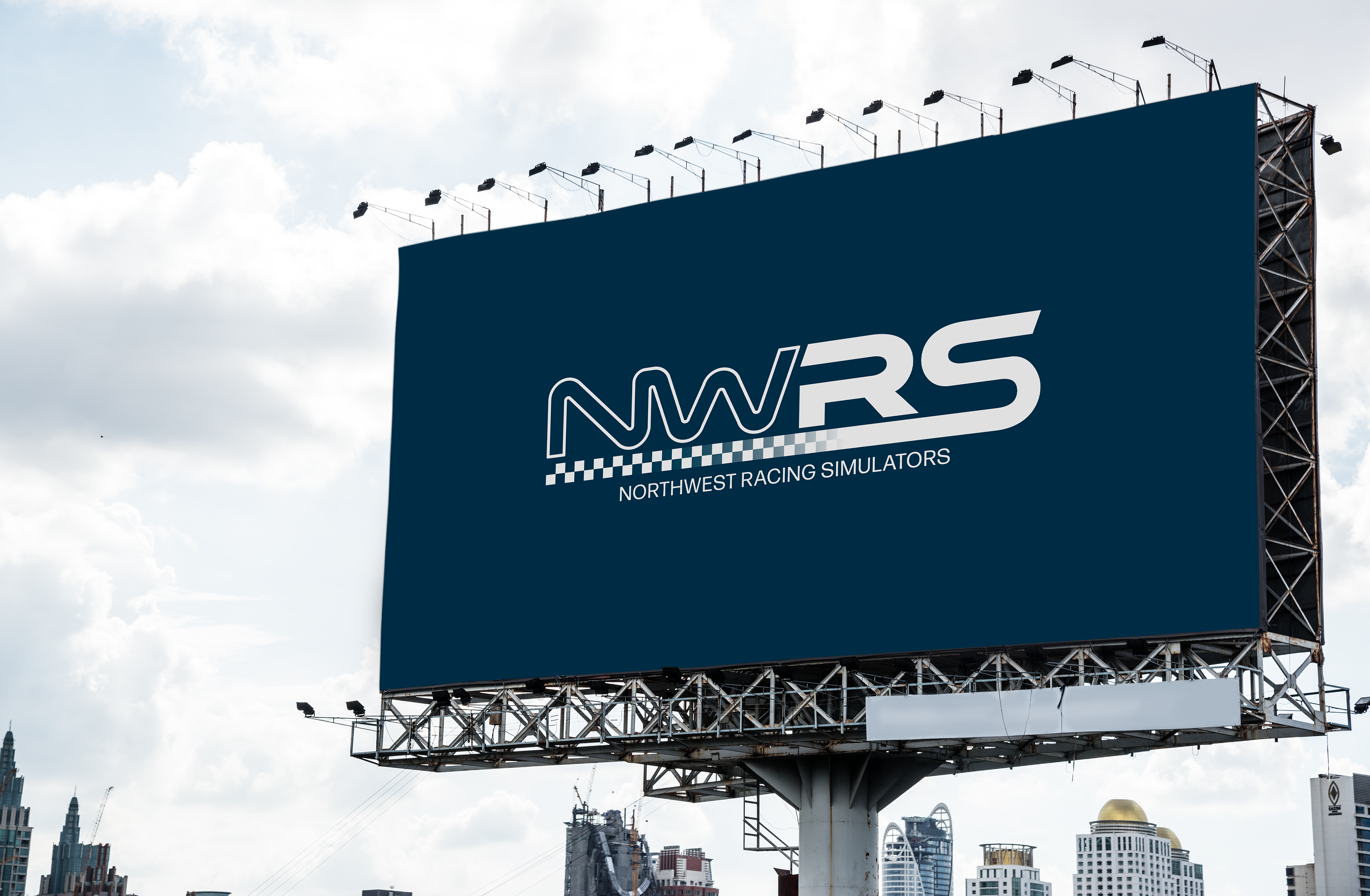
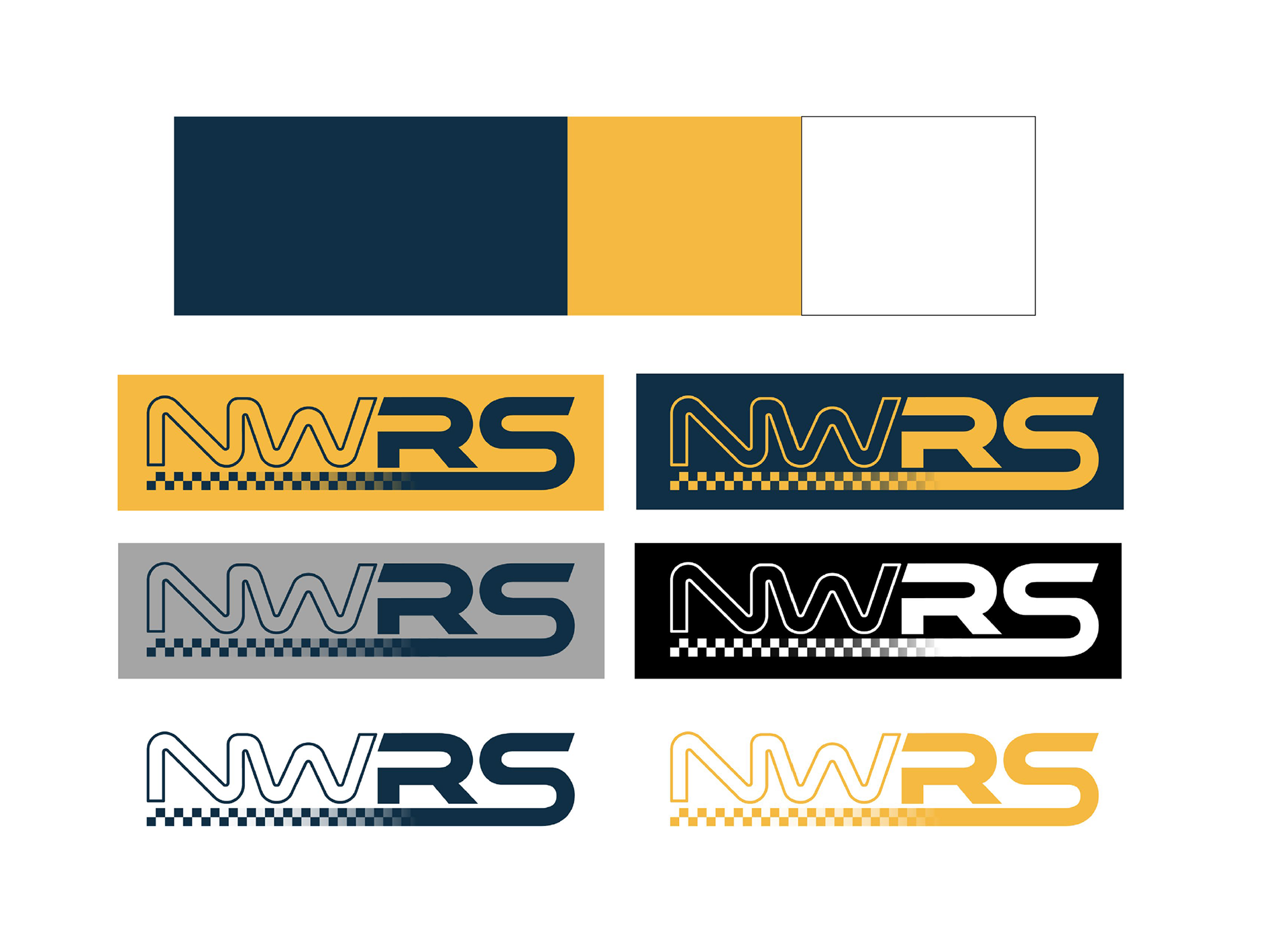
After reviewing the color options, the client was most drawn to one of the blue/yellow combos, but wanted to add in a grey tone instead of a white. We also landed on a few alternative versions of the logo to be used depending on the context.